Bigger and Better (x2)
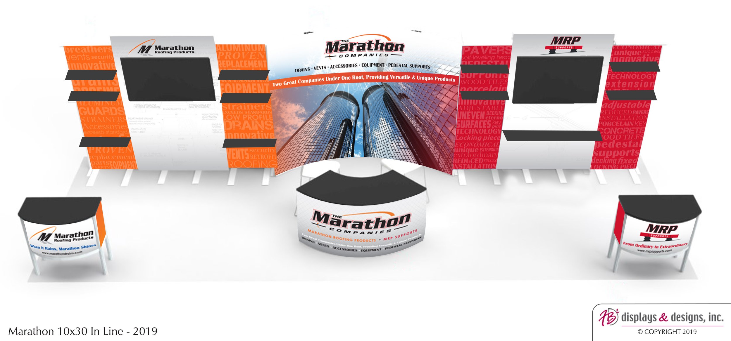
The Marathon Companies decided to make a splash at this year’s International Roofing Expo (IRE) by upgrading to an island booth. Our team at FB Displays & Designs previously designed a 30x10 inline display for them, so they once again turned to us for help in exhibiting better, and now bigger.
Design Brief
Client: The Marathon Companies (Marathon Roofing Products & MRP Supports)
Description: A leading distributor of commercial roof drains, vents, equipment and accessories / A supplier of adjustable paver supports, deck pedestals and fixed supports
What? New 20x20 Display
Where? IRE 2024
Why? Moving into a larger booth space - previously 10x30 inline
Design Goals
Our biggest directive, and challenge, was to use as much of the hardware from their 10x30 display as possible in the new booth. Beyond that, the Marathon team wanted:
Separate areas for each company
A monitor and product pedestals in each area
To take advantage of the height allowed in an island booth
To install the booth themselves, with a 3-4 person team
Design Process
Our design team started by creating about a dozen rough 3D models which explored a range of styles and layouts. Internally, we narrowed it down to four options:
A small tower, on a base made from MRP Supports products
A central wall with stylized overhead arches
A central wall with large tower
A central tower with corner alcoves
The Marathon team quickly narrowed down the layout of the display (a mash-up of options 3 and 4), but the tricky part proved to be properly designing the product pedestals. Depending on the number of pedestals, ranging from 4-12, and their construction, from corrugated cardboard to laminated wood, these could easily blow Marathon’s budget. After a few months of back-and forth, we arrived at the final design.
14’ w Dividing Wall, designed on one side for Marathon Roofing, and the other for MRP Support.
The central tower is capped by a rotating sign, which sits 14’ above the show floor.
(2) 3’w corner walls for highlighting new or special products
A tube-frame pedestal in front of each wall, which offered the best blend of price point and durability.
(2) Greeting counters in the remaining corners
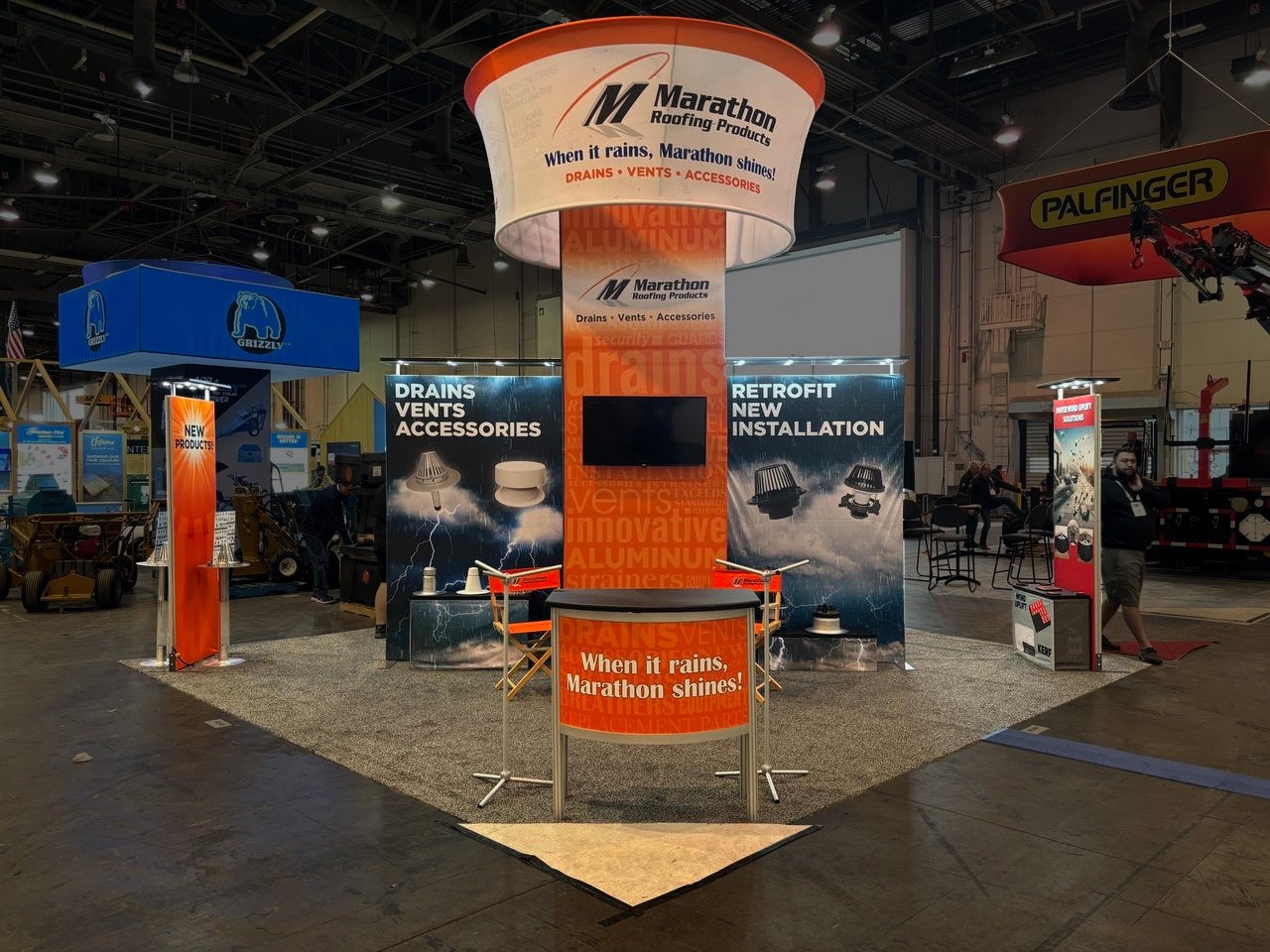
In the end, we were able to achieve our design goals, as we reused 2/3rds of Marathon’s existing display materials in the dividing walls, corner walls and corner counters. While the tower and rotating sign dominate the booth space, they are constructed from lightweight parts so the Marathon team was able to assemble the structure on the ground while avoiding the costly rigging fees for a traditional hanging sign.
We know this display will serve them well for years to come!
2025 is fast approaching, and if you’re not prepared, you’ll be stuck with late fees and rush charges for your events. We’ve compiled a timeline and a few tips to help you stay on track this coming trade show season.
Reflecting on the 30 years of FB Displays & Designs, Inc., it’s been an incredible journey filled with growth, challenges, and countless memories that have shaped who we are today.
This week we asked around the office to look ahead and predict the future. What will we see in the NEXT 30 years? What will we see from the company? The industry?
After the dust has settled of another busy trade show, performing a post-trade show analysis will help you determine your successes and areas for improvement.
Within weeks of joining Apogee, we were planning a trip to the premier industry trade show, ExhibitorLive. Tara, a few members from the main Apogee team, and I ventured down to…
The Marathon Companies decided to make a splash at this year’s IRE by upgrading to an island booth. Our team at FB Displays & Designs previously designed a 30x10 inline display for them…
I was armed with the show kit, which, back then, was printed on paper in a binder, and I felt like I was going to ace my first install….
Planning a new budget is the perfect time to assess your show program and ensure you’re being mindful in your decisions.
How do you make the most of a 10-by-10 space? Certainly, it's not easy to utilize every inch without creating a cacophony of clutter.
How do you know when it’s time to upgrade? It’s not always as simple as a broken piece you can’t replace.
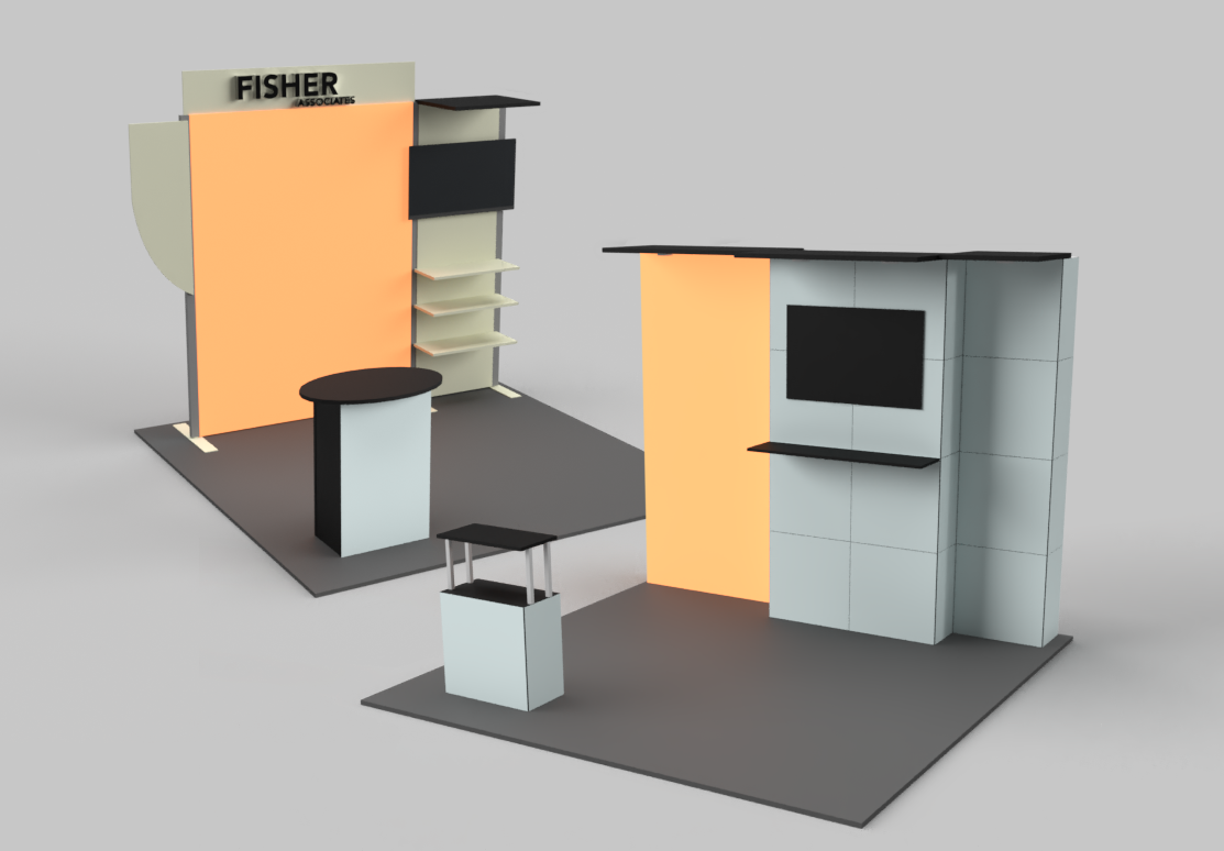
How do you know when to retire a display? It’s not always just because it breaks. When we first partnered with Fisher Associates…
When FB Displays and Designs was established in 1994, then called FB Portable Displays, carpeting was standard for any and…
The hardest part of a design is when you are staring at a blank page to start. An easy creative ice-breaker is to play around…
There is a lot of planning that goes into attending a trade show. However, if something goes wrong…
After a meeting with a marketing consultant in May, we came to the decision that it was time for a website makeover…
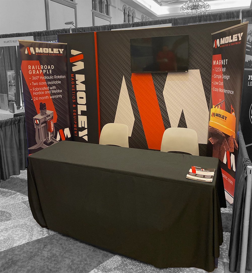
We partnered with the J. Fitzgerald Group to re-energized the Moley Magnetic brand with a bold and modern style.
We’re frequently asked what the big thing in displays is right now. For a time, our go-to answer has been backlighting. Now …
Trade shows are making a comeback but not everyone is ready to go full out on a new display. Exhibit rental is a great…
When people hear that I work in trade shows, they often say something along the lines of, “It must be amazing to get to travel…
In the three to seven-second glance passing attendees give you on the show floor, your graphics need to make them stop…
FB Displays and Designs is proud to announce its sponsorship of the newest exhibit in the Buffalo Naval Park museum…
Planning ahead will save you time and money on your next setup. Here’s a list of ten tips that will help…
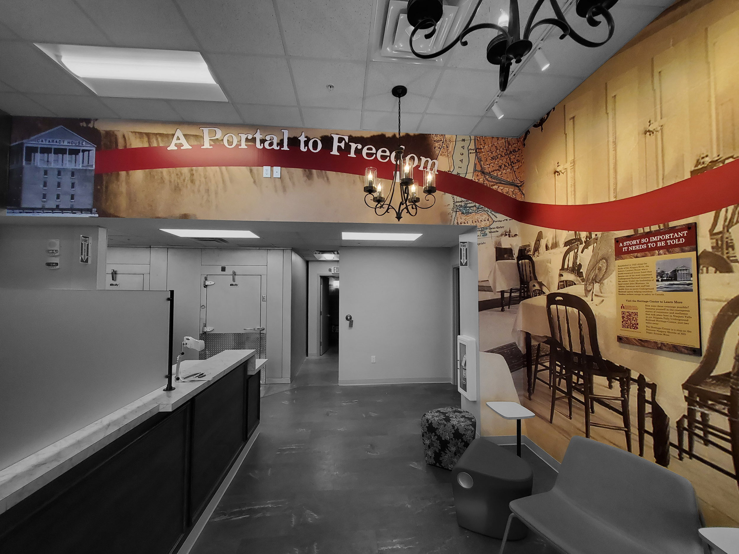
FB Displays and Designs is proud to celebrate the grand opening of The Cataract House Restaurant & Academy…
The Level display brings a unique blend of depth and motion to the show floor through its sliding panels and dimensional frame.
When showcasing your company at a trade show, your exhibit represents who your company is, and why you’re different from…
The New Year symbolizes new beginnings. When strategizing your new marketing initiatives, think about how…

