Would You Stop At Your Own Booth?
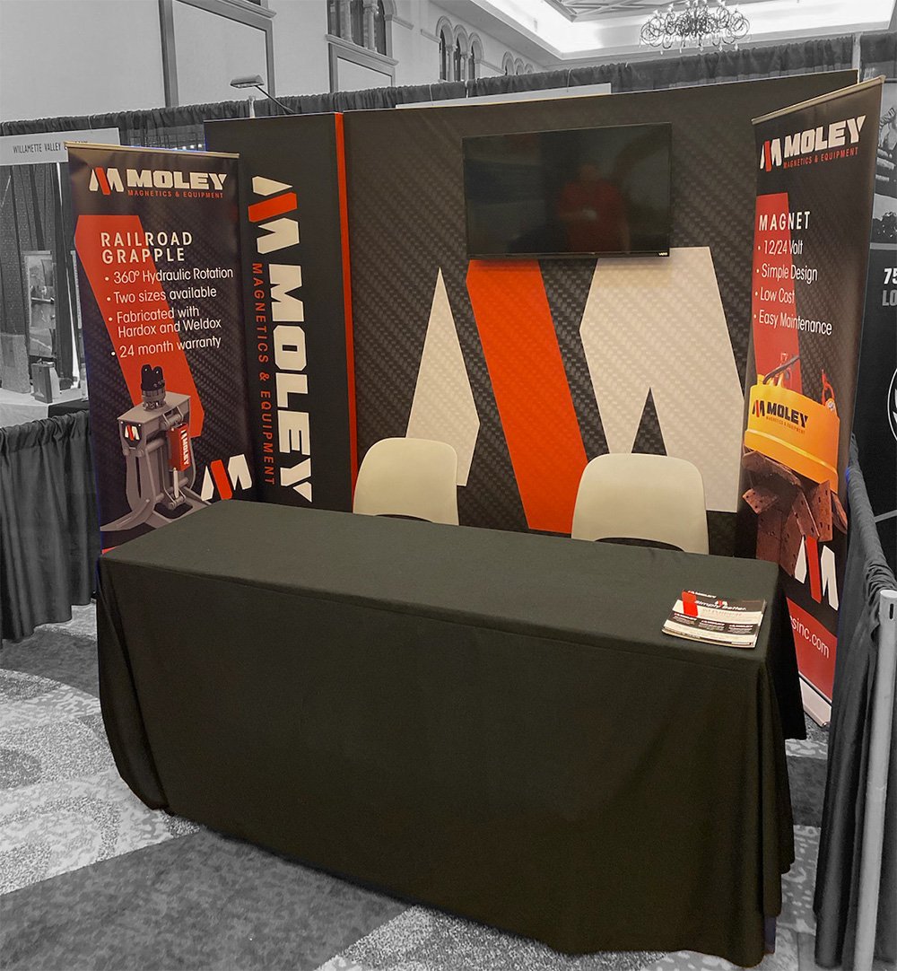
Your exhibit headline is your company’s greeting. In the three to seven second glance passing attendees give you on the show floor, the graphics in your exhibit space must clearly communicate who you are, what you sell, and what benefits you company can offer.
Six to Ten Words
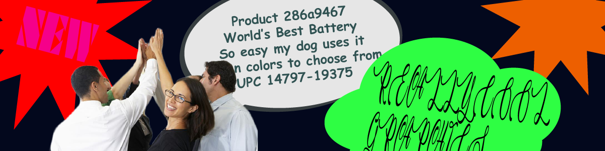
If your text takes more than three seconds to read, you’ve got too much text. This means your graphics can feature a maximum of roughly 6 to 10 words. Paired with an interesting image that communicates your message or offerings, the text should complement the accompanying image to create a powerful, cohesive message that stops people in their tracks and draws them into a conversation with booth staff.Talk Benefits, Attendees will Listen
With only a handful of words in your arsenal, message selection is critical – and benefit statements are key. Attendees only want to know what’s in it for them. For example, tell attendees your product ‘Cuts transportation costs by 20 percent!’ or that it can ‘Double your ROI.’ Don’t waste your word allotment to tell them how cool your company is or list product numbers and specs. Attendees just don’t care.High Contract Color Combinations
When it comes to color selection, text color must provide a sharp contrast with the background in order to have full effect. Effective color combinations are typically a dark color on a light background or vice versa.Use Clean Fonts
Graphics text should be clear and easy to read, not artsy. Leave the art to the imagery. Decorative fonts are difficult to read, and fight for attention by competing with the image, pulling the eye back and forth. Out of the three primary font styles – serif, sans serif, and decorative – serif and sans serif styles are the easiest to distinguish and read.Position Text at the Top
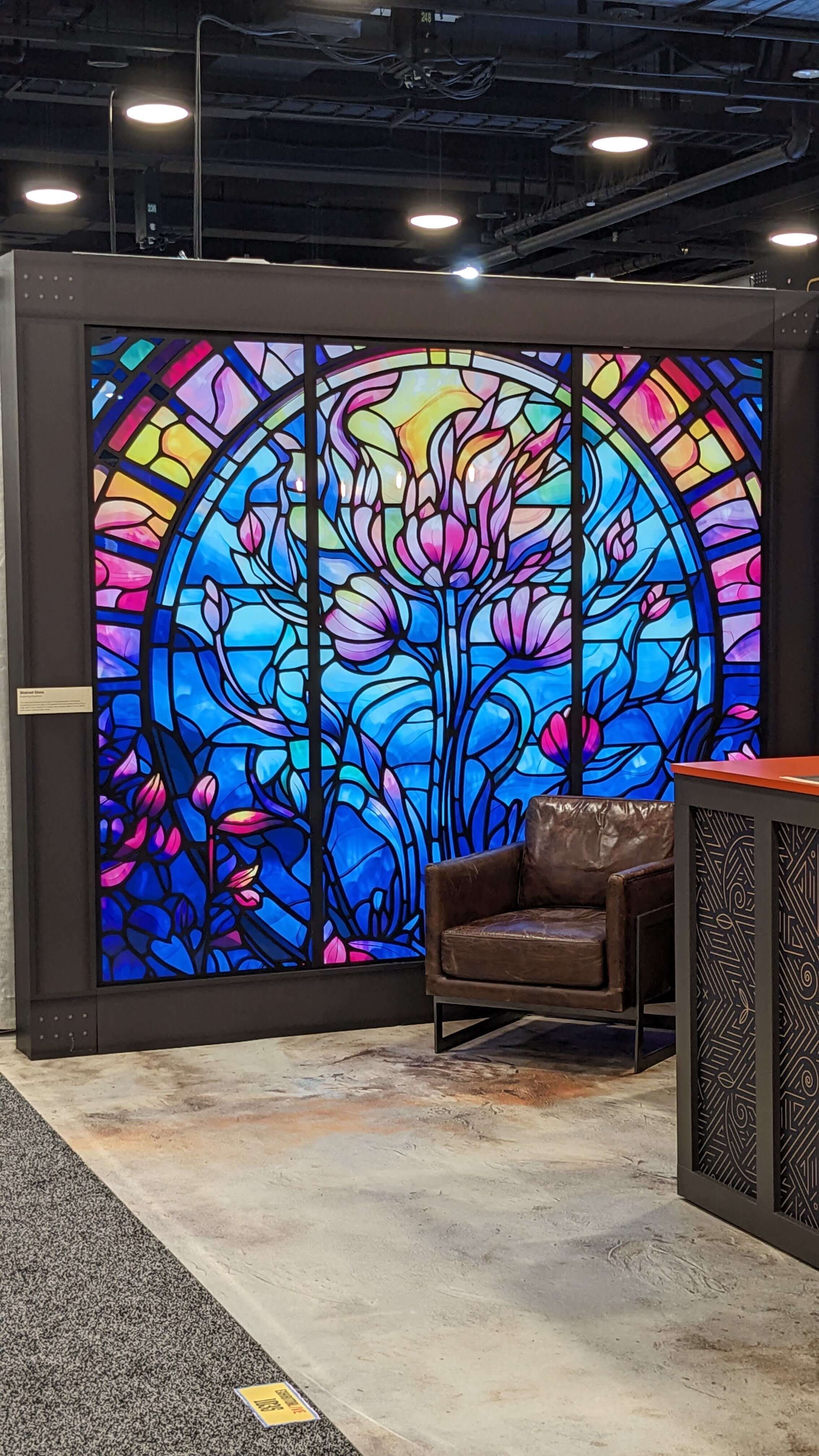
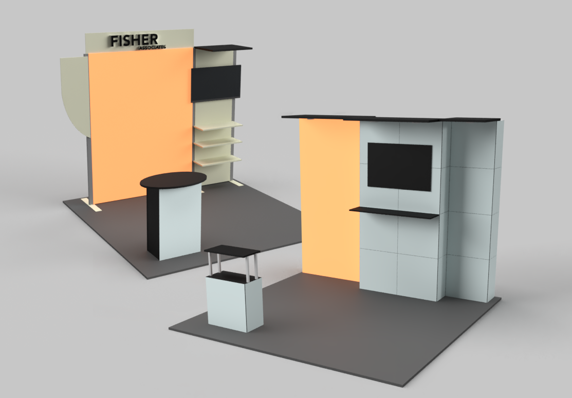
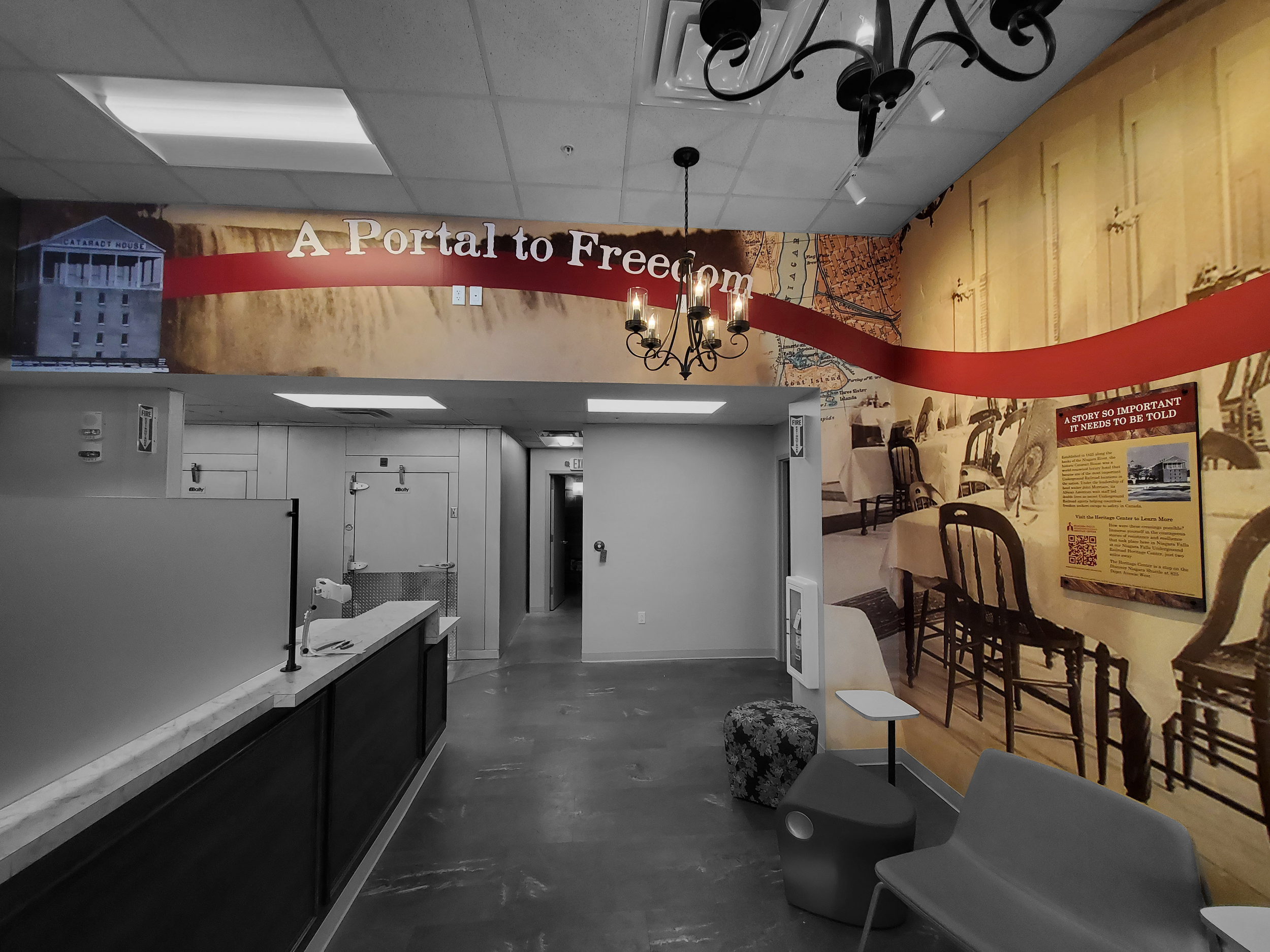
The 2-foot zone across the top of the exhibit is the ideal location for text. It’s the only unobstructed area on your exhibit’s back wall that people can see clearly in an aisle full of people. If you absolutely can’t position all of your text within the 2-foot zone across the top of the back wall of your exhibit, make sure it doesn’t go lower than eye level, which is roughly 5 feet up from the floor.
Adapted from Exhibitor Magazine, “Are Your Booth Graphics Effective?”